
HUB PLATFORM
REDESIGN
HUB PLATFORM
REDESIGN
HUB PLATFORM
REDESIGN
HUB PLATFORM
REDESIGN
Rebuilt and Simplified the product experience around clear workflows, so users can find what they need and get work done quickly, without relying on developers
Rebuilt and Simplified the product experience around clear workflows, so users can find what they need and get work done quickly, without relying on developers
Rebuilt and SImplified the product experience around clear workflows, so users can find what they x and get work done quickly, without relying on developers
85
85
%
%
Increase in User Efficiency
Increase in User Efficiency
38
38
%
Improved Task Completion
Improved Task Completion
10
10
X
Increase in Sales
50
50
%
Faster Client Onboarding
Faster Client Onboarding
Scroll down to begin
Scroll down to begin
Scroll down to begin
Scroll down to begin
Scroll down to begin
Scroll down to begin
Scroll down to begin
Scroll down to begin
HUB is a FinTech platform for asset managers and hedge funds. We are trying to centralize investment data and unify fund operations, reporting, compliance, and trade tools—so teams reduce manual work, gain reliable insights, and scale securely.
HUB is a FinTech platform for asset managers and hedge funds. We are trying to centralize investment data and unify fund operations, reporting, compliance, and trade tools—so teams reduce manual work, gain reliable insights, and scale securely.
HUB is a FinTech platform for asset managers and hedge funds. We are trying to centralize investment data and unify fund operations, reporting, compliance, and trade tools—so teams reduce manual work, gain reliable insights, and scale securely.
THE BRIEF
THE BRIEF
THE BRIEF
THE BRIEF
HUB’s platform originally operated as a collection of disconnected tools spread across multiple modules.
The platform had been built on the assumption that different personas would use different modules, but in reality the same users moved across them.
As a result, end-to-end tasks frequently forced users to hop across modules and duplicate data entry to stitch the flow together which often led to confusion and inefficiency.
*What HUB Looked Like Initially*
For context, On average, users spent 7 to 8 hours completing their end-to-end tasks, and onboarding clients often took one to two days due to extensive cross-module customizations.
This experience made it clear that we needed a better, more cohesive solution to streamline workflows and reduce manual effort.
The new approach unified the user journey into a single, guided workflow, enabling users to complete tasks faster and with less friction.
SETTING THE STAGE
SETTING THE STAGE
SETTING THE STAGE
SETTING THE STAGE
Understanding what we aimed to build, and how we measured success.
Understanding what we aimed to build, and how we measured success.
Understanding what we aimed to build, and how
we measured success.

On My iPad
Workflows PRD
Goals & Objectives
what are we Building?
Redesigning the entire product centered around end to end workflows
Asset-management teams: portfolio managers, analysts, compliance, and operations—plus internal sales who need a coherent demo narrative.
Shaurya, Hozefa (Team Lead), Will Smith (PO), Jonny Galbraith (PO) and others….
Users can’t complete end-to-end tasks efficiently because they have to jump between separate modules and re-enter the same data, slowing work and obscuring value.
Who all are people involved in this project?
Who is this for?
Why?
Workflows PRD
On My iPad
Workflows PRD
Goals & Objectives
what are we Building?
Redesigning the entire product centered around end to end workflows
Asset-management teams: portfolio managers, analysts, compliance, and operations—plus internal sales who need a coherent demo narrative.
Shaurya, Hozefa (Team Lead), Will Smith (PO), Jonny Galbraith (PO) and others….
Users can’t complete end-to-end tasks efficiently because they have to jump between separate modules and re-enter the same data, slowing work and obscuring value.
Who all are people involved in this project?
Who is this for?
Why?
EARLY EXPLORATIONS
EARLY EXPLORATIONS
EARLY EXPLORATIONS
EARLY EXPLORATIONS
What we heard, what we saw, what we learned
What we heard, what we saw, what we learned
What we heard, what we saw, what we learned
To redesign HUB effectively, we first needed to understand how users interacted with the existing tools and where they faced friction.
I led research across portfolio managers, ops teams, and stakeholders through the following methods :
To redesign HUB effectively, we first needed to understand how users interacted with the existing tools and where they faced friction.
I led research across portfolio managers, ops teams, and stakeholders through the following methods :
To redesign HUB effectively, we first needed to understand how users interacted with the existing tools and where they faced friction.
I led research across portfolio managers, ops teams, and stakeholders through the following methods :
User Interview (5)
User
Interview (5)
User Interview (5)
User
Interview (5)
Conducted one-on-one sessions with our existing users in key roles to uncover goals, pain points, and expectations.
Conducted one-on-one sessions with our existing users in key roles to uncover goals, pain points, and expectations.
Conducted one-on-one sessions with our existing users in key roles to uncover goals, pain points, and expectations.

Sales Demo Reviews (8)
Sales Demo
Reviews (8)
Sales Demo Reviews (8)
Sales Demo Reviews (8)
Analyzed recorded sales demos to identify where prospects struggled with the platform.
Analyzed recorded sales demos to identify where prospects struggled with the platform.
Analyzed recorded sales demos to identify where prospects struggled with the platform.
Stakeholder Sessions (4)
Stakeholder
Sessions (4)
Stakeholder Sessions (4)
Stakeholder Sessions (4)
Ran sessions with product owners & domain experts to gather insights on user challenges, operational gaps & strategic alignment.
Ran sessions with product owners & domain experts to gather insights on user challenges, operational gaps & strategic alignment.
Ran sessions with product owners & domain experts to gather insights on user challenges, operational gaps & strategic alignment.
Since we had a tight deadline—with the HUB platform redesign slated for the first week of September—I couldn’t run an extensive round of external interviews, so I spoke with internal HUB users (PMs, ops, compliance) as informed proxies to fold in secondary evidence—validating patterns and surfacing opportunities across features and IA.
While we accounted for potential bias, the variety of roles and usage contexts helped pressure-test assumptions quickly.
These combined insights laid a strong foundation for our redesign strategy, ensuring we addressed real user needs and business priorities
FINDINGS
FINDINGS
FINDINGS
FINDINGS
What we learned before we sketched
What we learned before we sketched
What we learned before we sketched
Some of our initial assumptions were validated, while others were challenged, as we uncovered how users truly interacted with the product.
Some of our initial assumptions were validated, while others were challenged, as we uncovered how users truly interacted with the product.
Some of our initial assumptions were validated, while others were challenged, as we uncovered how users truly interacted with the product.
“Do I need to buy these separately?”
Unclear Offering & Product Fragmentation
Unclear Offering & Product Fragmentation
Unclear Offering & Product Fragmentation
Users struggled to understand HUB’s modular structure.
This validated our assumption that tool-centric navigation caused confusion during onboarding and demos.
Users struggled to understand HUB’s modular structure.
This validated our assumption that tool-centric navigation caused confusion during onboarding and demos.
Users struggled to understand HUB’s modular structure.
This validated our assumption that tool-centric navigation caused confusion during onboarding and demos.
“It’s too many tabs. Everything feels disconnected.”
Users had to switch between tools and repeat steps across interfaces.
Users had to switch between tools and repeat steps across interfaces.
Users had to switch between tools and repeat steps across interfaces.
Users constantly jumped between modules to complete tasks, re-entering data and losing context—slowing them down and making the platform feel fragmented.
Users constantly jumped between modules to complete tasks, re-entering data and losing context—slowing them down and making the platform feel fragmented.
Users constantly jumped between modules to complete tasks, re-entering data and losing context—slowing them down and making the platform feel fragmented.
“Every part of the product works differently. I don’t know what to expect.”
Low Discoverability & Inconsistent Experiences
Low Discoverability & Inconsistent Experiences
Low Discoverability & Inconsistent Experiences
Important features were hard to find, and each module behaved differently.
Important features were hard to find, and each module behaved differently.
Important features were hard to find, and each module behaved differently.
“I just send a Slack link and hope they see it.”
Lack of Collaboration Support
Lack of Collaboration Support
Lack of Collaboration Support
Validated our assumption that embedding real-time collaboration would address a major pain point.
Users couldn’t assign tasks, tag teammates, or track shared workflows.
They relied on external tools to stay aligned.
Validated our assumption that embedding real-time collaboration would address a major pain point.
Users couldn’t assign tasks, tag teammates, or track shared workflows.
They relied on external tools to stay aligned.
Validated our assumption that embedding real-time collaboration would address a major pain point.
Users couldn’t assign tasks, tag teammates, or track shared workflows.
They relied on external tools to stay aligned.
It's tough to sell the big picture when you're forced to demo pieces—our customers want a unified solution, not a patchwork of separate tools.
Sales and Storytelling Misalignment
Sales and Storytelling Misalignment
Sales and Storytelling Misalignment
Because HUB was structured around separate tools, sales teams struggled to communicate a clear, unified value proposition—often demoing multiple tools in isolation.
Because HUB was structured around separate tools, sales teams struggled to communicate a clear, unified value proposition—often demoing multiple tools in isolation.
Because HUB was structured around separate tools, sales teams struggled to communicate a clear, unified value proposition—often demoing multiple tools in isolation.
We started with an assumption about how people would use HUB—but research proved reality looked very different. Users were struggling, and it was clear that simple fixes wouldn’t be enough.
We started with an assumption about how people would use HUB—but research proved reality looked very different. Users were struggling, and it was clear that simple fixes wouldn’t be enough.
We started with an assumption about how people would use HUB—but research proved reality looked very different. Users were struggling, and it was clear that simple fixes wouldn’t be enough.
WIREFRAMES
WIREFRAMES
WIREFRAMES
WIREFRAMES
Instead of reinventing the wheel, we leaned into what felt familiar: Excel and spreadsheets.
By echoing those patterns in our design, we ensured the tool felt intuitive and familiar, letting users dive in and get things done with hardly any learning curve at all.
Instead of reinventing the wheel, we leaned into what felt familiar: Excel and spreadsheets.
By echoing those patterns in our design, we ensured the tool felt intuitive and familiar, letting users dive in and get things done with hardly any learning curve at all.
Instead of reinventing the wheel, we leaned into what felt familiar: Excel and spreadsheets.
By echoing those patterns in our design, we ensured the tool felt intuitive and familiar, letting users dive in and get things done with hardly any learning curve at all.

Version 1
Version 1
Version 1
This approach was chosen to make HUB easy to find, start, and finish work—without jumping around.
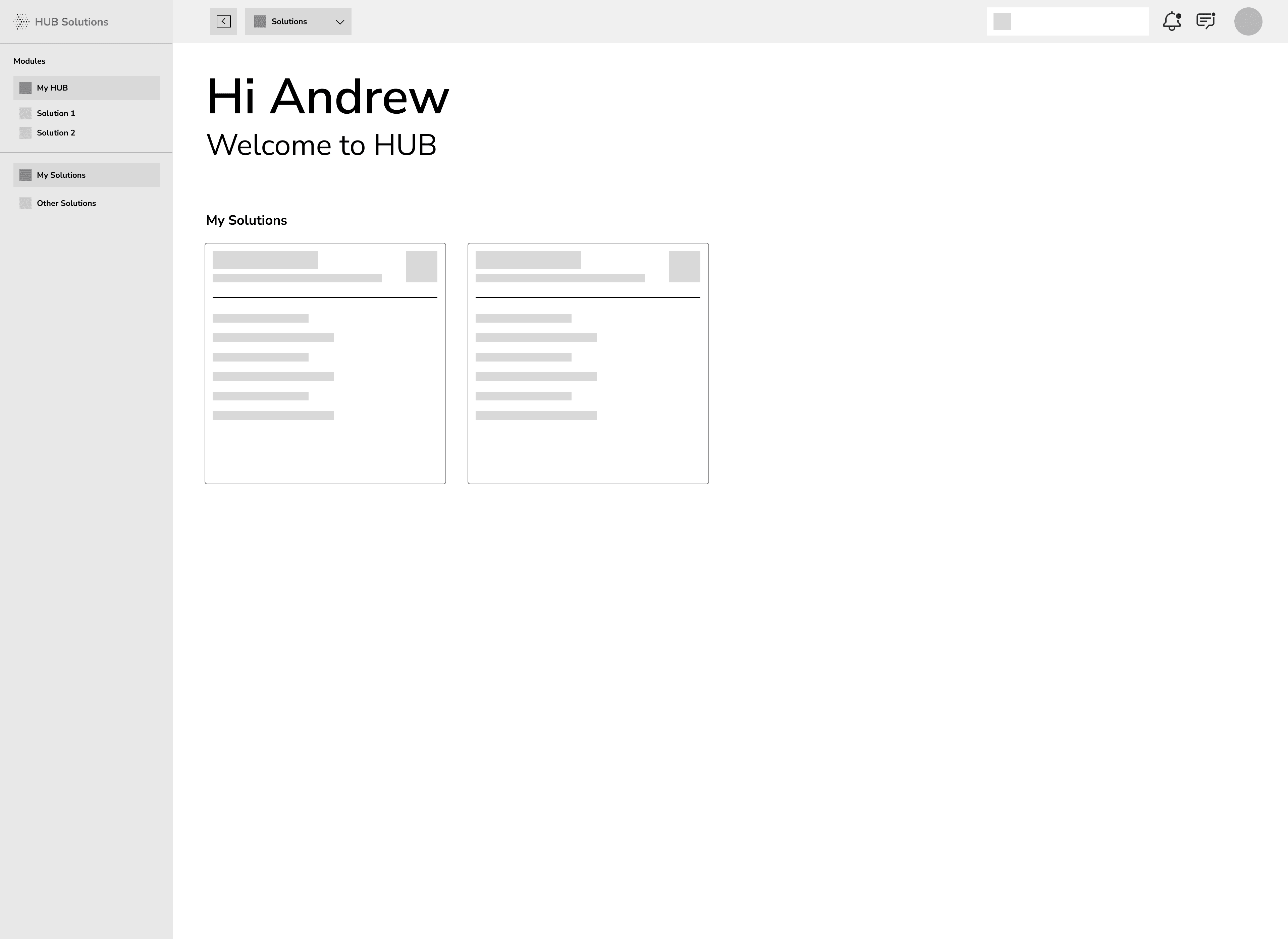
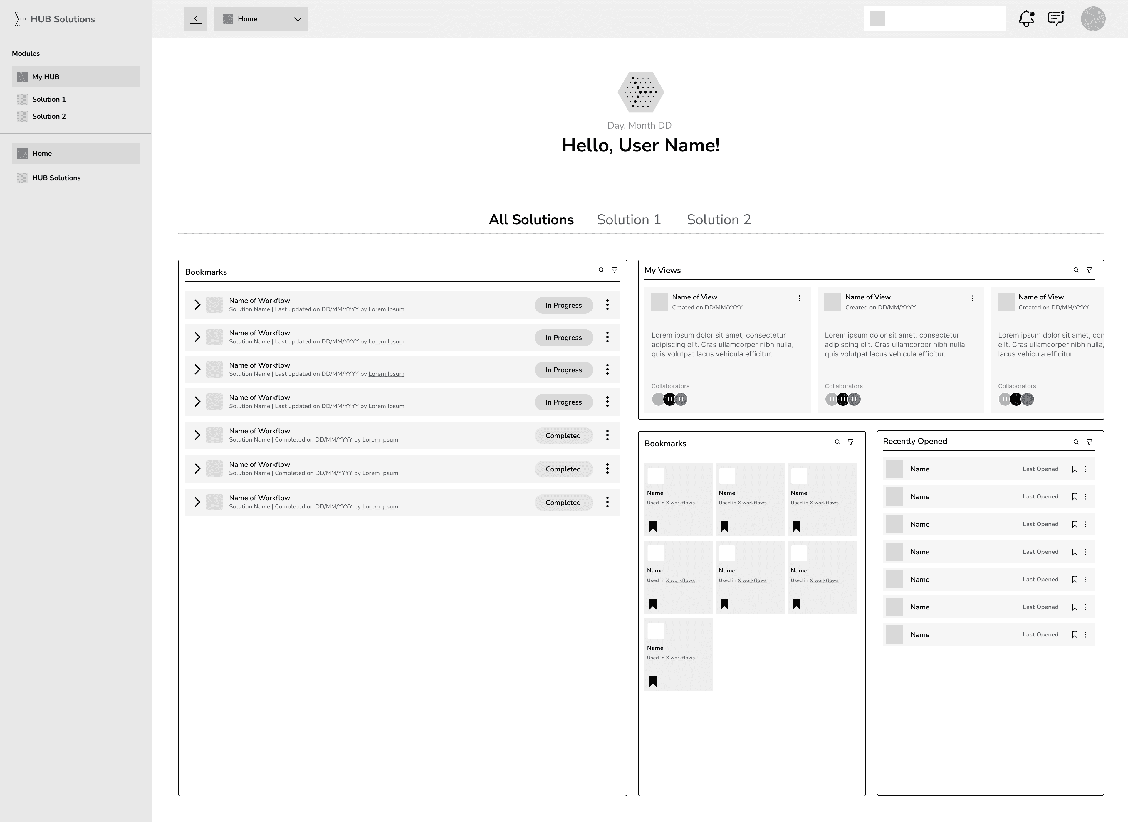
Our first priority was simple: make navigation effortless. We split the product into Modules (MyHUB + purchased Solutions, with unpurchased ones visible for awareness in a separate tab) and Navigation (move within the current module).
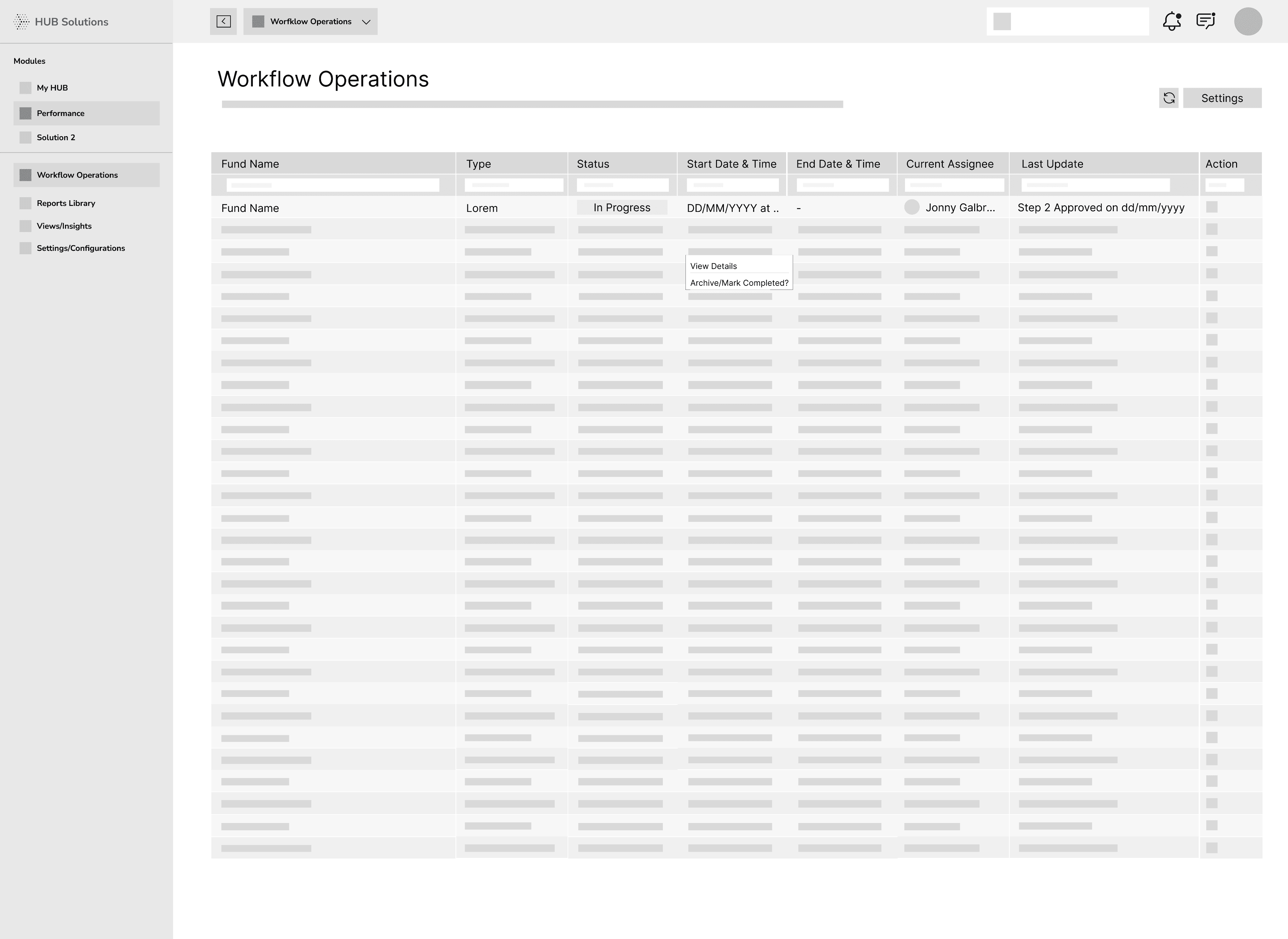
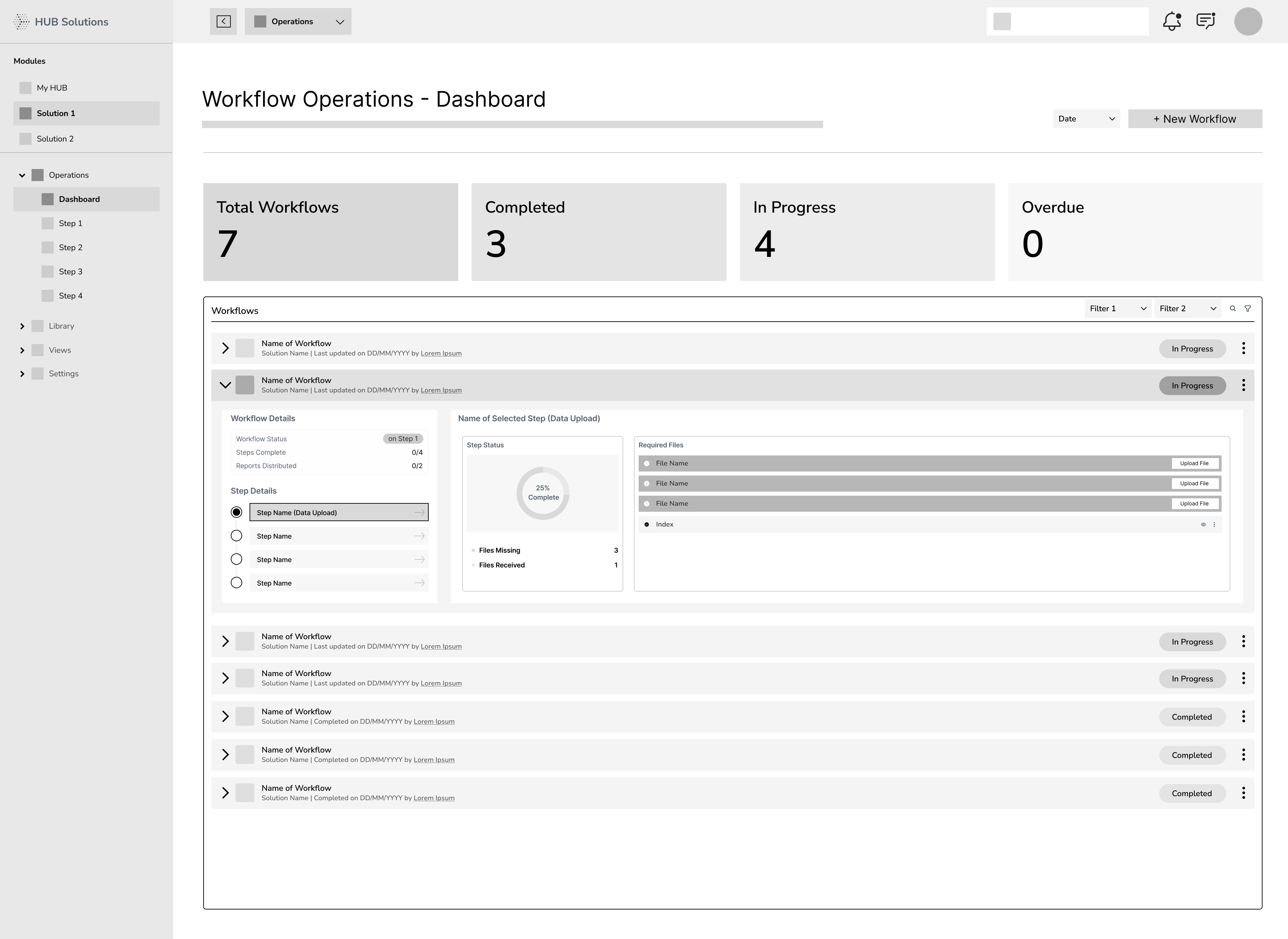
Inside each Solution, we defined four clear areas to keep things predictable: Operations (assigned workflows), Library (final outputs), Viewer (dashboards from completed runs), and Settings (configuration). By default, selecting a Solution opens Operations, a grid of workflows with key status and metadata.
Because workflow detail can be extensive, we chose a dedicated workflow page. A vertical stepper on the left shows every step and its status; the right panel displays the selected step’s details and any actions the user can take. This keeps context intact while reducing cognitive load.
This approach was chosen to make HUB easy to find, start, and finish work—without jumping around.
Our first priority was simple: make navigation effortless. We split the product into Modules (MyHUB + purchased Solutions, with unpurchased ones visible for awareness in a separate tab) and Navigation (move within the current module).
Inside each Solution, we defined four clear areas to keep things predictable: Operations (assigned workflows), Library (final outputs), Viewer (dashboards from completed runs), and Settings (configuration). By default, selecting a Solution opens Operations, a grid of workflows with key status and metadata.
Because workflow detail can be extensive, we chose a dedicated workflow page. A vertical stepper on the left shows every step and its status; the right panel displays the selected step’s details and any actions the user can take. This keeps context intact while reducing cognitive load.
But, there were a few issues in this version of the wireframe
But, there were a few issues in this version of the wireframe
But, there were a few issues in this version of the wireframe
MyHUB felt unclear
MyHUB felt unclear
MyHUB felt unclear
Even though the new structure tested well, several stakeholders weren’t sure what MyHUB uniquely offered. It seemed to repeat info from elsewhere, so its purpose wasn’t clear.
Even though the new structure tested well, several stakeholders weren’t sure what MyHUB uniquely offered. It seemed to repeat info from elsewhere, so its purpose wasn’t clear.
Even though the new structure tested well, several stakeholders weren’t sure what MyHUB uniquely offered. It seemed to repeat info from elsewhere, so its purpose wasn’t clear.
Operations was heavy to parse
Operations was heavy to parse
Operations was heavy to parse
With no KPI cards or visual cues, it took longer to spot what mattered first. Important signals didn’t stand out, so prioritizing work was tougher.
The Operations table surfaced a lot at once. Users could see the current status, but checking earlier steps meant opening a separate page—adding effort and breaking focus.
Modal-first made more sense here.
Modal-first made more sense here.
Modal-first made more sense here.
Walkthroughs showed most workflows have a manageable set of steps (4–5). Opening a modal first lets users review status, see a quick summary, and act—without leaving the dashboard. The full details page stays available for deeper work when needed.
Walkthroughs showed most workflows have a manageable set of steps (4–5). Opening a modal first lets users review status, see a quick summary, and act—without leaving the dashboard. The full details page stays available for deeper work when needed.
Walkthroughs showed most workflows have a manageable set of steps (4–5). Opening a modal first lets users review status, see a quick summary, and act—without leaving the dashboard. The full details page stays available for deeper work when needed.
To help users grasp the most important info fast, we added KPI cards to all dashboard pages. We also replaced the dense grid with accordions, which cut cognitive load and made status scanning quicker. With accordions, users can expand a workflow to peek at previous steps or the next step without leaving the page—keeping decisions quick and context intact.
To help users grasp the most important info fast, we added KPI cards to all dashboard pages. We also replaced the dense grid with accordions, which cut cognitive load and made status scanning quicker. With accordions, users can expand a workflow to peek at previous steps or the next step without leaving the page—keeping decisions quick and context intact.
To help users grasp the most important info fast, we added KPI cards to all dashboard pages. We also replaced the dense grid with accordions, which cut cognitive load and made status scanning quicker. With accordions, users can expand a workflow to peek at previous steps or the next step without leaving the page—keeping decisions quick and context intact.
Version_final_228392992838911029
Version_final_228392992839
Version_final_228392992838911029
After many rounds of Feedbacks, this was the flow which was finalised for Workflows
After many rounds of Feedbacks, this was the flow which was finalised for Workflows
After many rounds of Feedbacks, this was the flow which was finalised for Workflows
FINAL DESIGNS
FINAL DESIGNS
FINAL DESIGNS
FINAL DESIGNS
At the core of this redesign was the introduction of a workflow-first model — a new way of structuring the product around how users actually work. Instead of jumping between separate tools, users could now complete end-to-end tasks through a single, connected experience.
At the core of this redesign was the introduction of a workflow-first model — a new way of structuring the product around how users actually work. Instead of jumping between separate tools, users could now complete end-to-end tasks through a single, connected experience.
At the core of this redesign was the introduction of a workflow-first model — a new way of structuring the product around how users actually work. Instead of jumping between separate tools, users could now complete end-to-end tasks through a single, connected experience.
Since this is a B2B product, design flexibility was limited, with the primary focus on functionality over aesthetics. Accordingly, I aimed to maximize reuse of existing components and design tokens, introducing new components only where absolutely necessary to meet specific needs.
Since this is a B2B product, design flexibility was limited, with the primary focus on functionality over aesthetics. Accordingly, I aimed to maximize reuse of existing components and design tokens, introducing new components only where absolutely necessary to meet specific needs.
Since this is a B2B product, design flexibility was limited, with the primary focus on functionality over aesthetics. Accordingly, I aimed to maximize reuse of existing components and design tokens, introducing new components only where absolutely necessary to meet specific needs.
GLIMPSE OF SOME OF THE WORKFLOWS
GLIMPSE OF SOME OF THE WORKFLOWS
GLIMPSE OF SOME OF THE WORKFLOWS
Operations Workflow (Non-Linear)
Operations Workflow (Non-Linear)
Operations Workflow (Non-Linear)
Create a New View Workflow
Create a New View Workflow
Create a New View Workflow
HUB Solutions Page (Old vs New)
HUB Solutions Page (Old vs New)
HUB Solutions Page (Old vs New)
UI SNIPPETS
UI SNIPPETS
UI SNIPPETS
UI SNIPPETS
HANDOFF / KT
HANDOFF / KT
HANDOFF / KT
HANDOFF / KT
Over 3 months I worked closely with stakeholders to build this feature. From day 1, the CPO, PM, PO, engineers and BA’s were a part of our ideation and feedback sessions
Over 3 months I worked closely with stakeholders to build this feature. From day 1, the CPO, PM, PO, engineers and BA’s were a part of our ideation and feedback sessions
Over 3 months I worked closely with stakeholders to build this feature. From day 1, the CPO, PM, PO, engineers and BA’s were a part of our ideation and feedback sessions
For internal testing, I built a hi-fi prototype in Figma. We were also able to test these prototypes with some of our users and make changes accordingly
For internal testing, I built a hi-fi prototype in Figma. We were also able to test these prototypes with some of our users and make changes accordingly
For internal testing, I built a hi-fi prototype in Figma. We were also able to test these prototypes with some of our users and make changes accordingly
Once the designs were finalised with stakeholder feedback and iterative testing, I prepared a detailed Dev handoff file.
Once the designs were finalised with stakeholder feedback and iterative testing, I prepared a detailed Dev handoff file.
Once the designs were finalised with stakeholder feedback and iterative testing, I prepared a detailed Dev handoff file.
This included annotations via sticks notes on flows, component states and responses, ensuring clarity for the dev team. Hand off does not end in Figma, I collaborated closely with the developers to address edge cases and refine interactions during the implementation stage .
This included annotations via sticks notes on flows, component states and responses, ensuring clarity for the dev team. Hand off does not end in Figma, I collaborated closely with the developers to address edge cases and refine interactions during the implementation stage .
This included annotations via sticks notes on flows, component states and responses, ensuring clarity for the dev team. Hand off does not end in Figma, I collaborated closely with the developers to address edge cases and refine interactions during the implementation stage .
IMPACT
IMPACT
IMPACT
IMPACT
85
85
%
Increase in User Efficiency
Increase in User Efficiency
7
hrs
1
hrs
Time taken to complete their proces
10
10
X
Increase in Sales
Increase in Sales
1
10
+
Growth in Clients since the redesign
Growth in Clients since the redesign
50
50
%
Faster Onboarding
Faster Onboarding
2
1
weeks
Time taken to onboard new clients
Time taken to onboard new clients
38
38
%
Improved Completion
Improved Completion
40
%
78
%
Users successfully finishing key tasks post the Redesign
With the product now live, our focus has shifted to post-launch optimization. We're closely tracking usage patterns and performance through analytics, while actively engaging with users to gather feedback. These insights help us identify areas to streamline workflows further, enhance usability, and ensure the platform continues to evolve in line with real user needs.
With the product now live, our focus has shifted to post-launch optimization. We're closely tracking usage patterns and performance through analytics, while actively engaging with users to gather feedback. These insights help us identify areas to streamline workflows further, enhance usability, and ensure the platform continues to evolve in line with real user needs.
With the product now live, our focus has shifted to post-launch optimization. We're closely tracking usage patterns and performance through analytics, while actively engaging with users to gather feedback. These insights help us identify areas to streamline workflows further, enhance usability, and ensure the platform continues to evolve in line with real user needs.